http://youtu.be/7ABy5wcAXCo
Overall, I did enjoy this class because the projects were all different and unique. I do wish that we could have taken more pictures and learned how to use the cameras more, however I know there was issues with having enough working cameras, which is disappointing. I learned a lot about Photoshop and everything that it can do. In the future I would like to learn more about cameras and experience taking more pictures. I was not always satisfied with the work I did because I did not know enough about Photoshop.
Wednesday, December 18, 2013
Tuesday, December 17, 2013
Thursday, December 12, 2013
Practice stop motion film
In this video I used 105 pictures to create a video of a mouse going to his computer home.
Tuesday, December 10, 2013
Revised learner profile ad
Revision suggestion: The poster ad she did is pretty good. What I like about it is that she displayed what she thinks about caring. Her images are very interesting and well put together. All of the images show something that represent caring. An example would be the recycling picture with the tree branch because people who recycle care about the environment and that's caring. Her image quality is also very nice. One thing she could of done better though is adjust the brightness so the images could be easier to see. Other than that, her Learner Profile advertisement in my opinion was nearly perfect.

To revise this, I bumped up the brightness and contrast on the objects in the picture and the background. I also made the picture more vibrant and blurred the edges of the pictures to make them blend better. I also changed the text to "Helping others spread empathy" instead of "helping others to spread empathy/"
Wednesday, December 4, 2013
Magazine Revision Critique for Logan
The background and font used is appealing for an advertisement because it is clean and allows the main object to be in focus. The idea of the headphones is a good idea but they could be formed into some sort of shape, such as a radio or iPod. The headphones are not cut out cleanly and kind of don't look like headphones. The advertisement could also use body text instead of just a title. The colors of the advertisement are good.
Monday, December 2, 2013

Thursday, November 21, 2013
Learner Profile

Being diverse and accepting others from different places and cultures is caring because it gives everyone the same opportunities and accepts them into society.
Motivating others to do well and live life in a positive way is done by caring for others and spreading empathy. Also providing resources to others that are in need for the holidays displays this character trait in a big way.
Caring also means helping maintain the environment and the world we live in. This is represented by the recycling symbol next to the tree branch.
Monday, November 11, 2013
Composition shoot
 Run off 3 edges
 Variety of shapes and sizes
 Repeated shapes
 Use a focal point
 S-curve
 rule of thirds
 Make negative space interesting
 Overlapping
 Use the whole space
Tuesday, November 5, 2013

Friday, November 1, 2013
Recontextualizing and gaze-position


Gaze- position is the way the intended audience is supposed to view at the picture or advertisement. Creating a certain gaze position can target the people a cpmpany or artist wants to target. Recontextualization is when a familiar image or ad is changed or put in a different environment to change the gaze-position and the audience.
In my recontextualizing project, I took coke and pepsi advertisements and changed them to display how unhealthy the product actually is. I used photoshop tools such as the paint brush tool, liquify, the clone stamp, and the text tool. The ads are to create awareness of the health risks these sodas result in.
In the coke advertisement, the ad was changed to "perfectly fattening," because what other kind of "perfection" could coke bring? Im sure diabetes is not perfection. I also changed the image so that the person holding the coke bottle is a bit more chubby in the face that in the actual ad. She looks a litter ridiculous, however I wanted to keep the same person in the ad to create the effect that fit, healthy woman were not as likely to be the buyers of coke.
In the pepsi ad, the straw is refusing to go into the coke can, obviously directed towards pepsi drinkers and people who argue over which one is better. However, when the ad is recontextualized, pepsi and coke are both so poisonous, that the cans and straws are being eaten away and distorted by a brown acid. Along with picture is a text box cantaining the words "Doesn't matter which one you chose" because they are both equally hazardous.
By recontextualizing these images, the message changes completely, by only adding a few details. The audience is changed and a new idea is born.
Wednesday, October 30, 2013
MYP Unit
Unit 2: Persuasive ImageryUnit Question: Does seeing mean believing?
Significant Concepts:
Significant Concepts:
- How to deduce bias from contextual clues (both textually and visually)
- How to analyse and explain the use of design elements in advertisement
- How to infer and explain gaze position/demographic/target audiences of media
- How to recognize and deconstruct semiotics within media/advertisements
Tuesday, October 8, 2013
Still life


Objects and meanings:
letter from my mom- most important person in my life
hair brush-beauty
panda necklace- favorite animal and special
origami heart from my best friend- friendship
guitar picks-music
picture with my boyfriend- important person in my life
paint brushes-artist
makeup-beauty
volleyball-favorite hobby
perfume-feminine
graduation tassel-success
glasses-intelligence
To create the still life pictures that represent me, I set the camera with an appature between f/8 and f/18, depending on the lighting. The shutter speed was also adjusted to compensate the appature to let in kore light or not. To edit the photos, I used the cropping tool, photo adjustments, exposure adjust ments, and color adjustments.
The object in my photo contain three things from the most important people in my life: my mom, my best friend, and my boyfriend. It also shows my hobbies which are painting, volleyball, and music. I take pride in the way i hold my sekf and present myself to the world, which is why i added the perfume, brush, and makeup. I work very hard in school and am driven by success, which is represented by the glasses and graduation tassel.
Wednesday, October 2, 2013
object plan
necklace- fashion
paint brush- paitning
locket
glasses
bible
flower?
panda
picture
cross
oragami heart
paint brush- paitning
locket
glasses
bible
flower?
panda
picture
cross
oragami heart
Video Response
Should images of models that have been photoshopped be labelled? Why or why not?
Photoshopped images of models should be labelled because they are examples of what girls want to look like. An impossible perception of perfection is being made with these images and young girls and women try to look like that. Self-esteem could easily be brought down when results are not showing the "perfect" body image shown in magazines and ads. Media has created this idea of perfection that is impossible. Why should the media have to tell young women what they should look like and the perfect idea of beauty? Media should be promoting the idea that everyone is beautiful instead of an impossible state of what women should strive to look like.
Photoshopped images of models should be labelled because they are examples of what girls want to look like. An impossible perception of perfection is being made with these images and young girls and women try to look like that. Self-esteem could easily be brought down when results are not showing the "perfect" body image shown in magazines and ads. Media has created this idea of perfection that is impossible. Why should the media have to tell young women what they should look like and the perfect idea of beauty? Media should be promoting the idea that everyone is beautiful instead of an impossible state of what women should strive to look like.
Monday, September 30, 2013
Appature
shallow
 In this photo I set appature to f/3 to create a blurred background.
medium
 In this photo I set appature to f/8 to create a little more focus.
deep
 In this picture the appature was set to f/16 to focus all the objects in the picture.
 Wednesday, September 25, 2013

Monday, September 23, 2013
Picture Change
 original
  changed
 highlighted
For this project i used tools such as the clone tool, the healing brush tool, magic wand tool, copy and paste, the burning tool, and the brush tool. I changed 20 things from the original photo including erasing objects, adding them, or creating multiple copies of them. Some of the changes are subtle and some are obvious.
Tuesday, September 17, 2013
Color wheel

I created this color wheel by using the transformation tool and warping each individual picutre to create different shapes. I arranged them in a way that was different and not like a normal color wheel. For the background, i used the gradient tool to make it black. Each color was found in a different place around the school.
Wednesday, September 11, 2013


Thursday, September 5, 2013
photo montage object


Wednesday, August 28, 2013


Thursday, August 22, 2013


Tuesday, August 20, 2013
Types of photos
 Backlighting: The source of light is behing the focused object and creates a silouette.
  Side lighting: the light source is being provided from the side of the image and creates a shadow on the other side of the object
 Angle up: The angle looking up to the pedal of a motarcycle creates a different view on the object
 Angle Down: the camera is parallel with the ground looking at an object below
 Rule of thirds: The bike tires are in 1/3 of the picture and creates a more focused object
  Reflection : there is a reflection of outside in the glass of the display case that holds the head dress
 Shadow: The main focus of the picture is the shadow
 Frame within a frame: the fence serves as a frame within the picture of the field
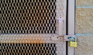 pattern : the pattern on the door is the main focus of the picture
 Texture: the texture of the chipping wood is focused on in the picture
 Perspective: the window is shot at an angle that provides one point perspective
Subscribe to:
Comments (Atom)